Making of The Orb Plugin
Working on an audio plugin requires a lot of focus on several different aspects. The first step is always trying to find a good product idea, something new that’s never done before, or a different (perhaps better) take on something that’s already there. There were very few dedicated formant filter plugins when I started working on The Orb, so that was a plus.
After validating a plugin idea, I try to make a list of the features and parameters to include. This helps to plan the work on the DSP, which is usually done with very basic graphic elements.
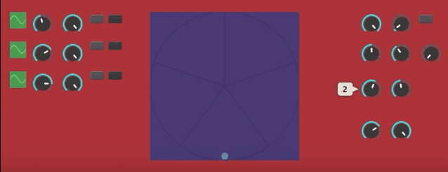
To simulate the sound of a vowel I used three 24dB/oct bandpass filters tuned to specific frequencies. The Orb features three types of vowel sets (male, female, child) which are slightly different frequency sets to simulate the vocal tract for each type. An important parameter I wanted to add was the Drift, which is essentially an amount in Hz that will be added or subtracted from each vowel formant. Modulating these parameters can be useful to get that talkbox/wah-wah sound.
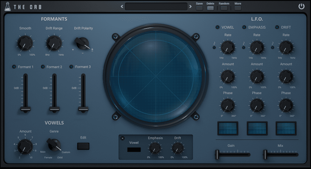
After working on the DSP, the hardest part of making a plugin is designing the layout. Finding the right arrangement for the controls, the right balance among sections, while keeping functionality, requires a lot of time. The goal with The Orb was to make a dynamic format filter. The three main controls (vowel, emphasis, drift) had to be modulated by LFOs. This was a problem because each LFO has 3 knobs (Rate, Depth, Phase), a sync switch, and a waveform box. Too many controls!
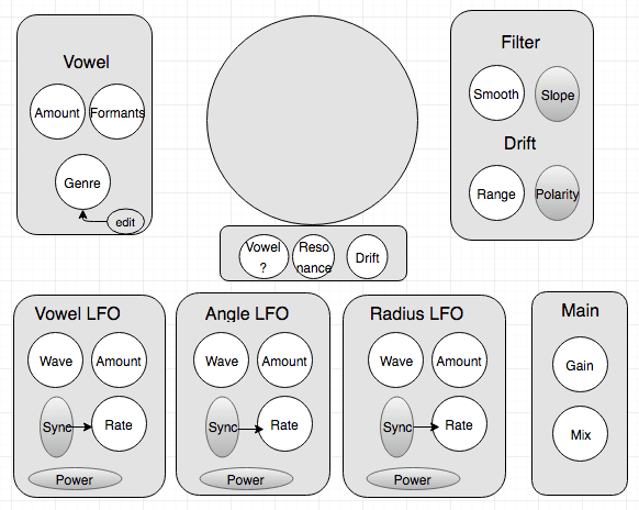
So, after tens of mockups and tests on different layouts, it was finally time to find the right design idea.
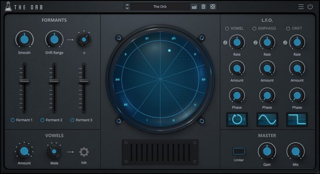
I wanted the vowel orb to be some kind of vintage sonar/oscilloscope, so I asked my designer to do the usual skeuomorphic style we use on most of our emulation plugins. But, after a whole month of beta testing, the UI was starting to feel dull. So we went for a more modern approach, flat controls with dynamic label/value (instead of the usual popup to show the value of the control). Actually, the only skeuomorphic thing that felt right was the orb, so we kept that and luckily it blended quite well with the rest of the design.
Sign up to our newsletter for more behind the scenes or learn more about The Orb.

